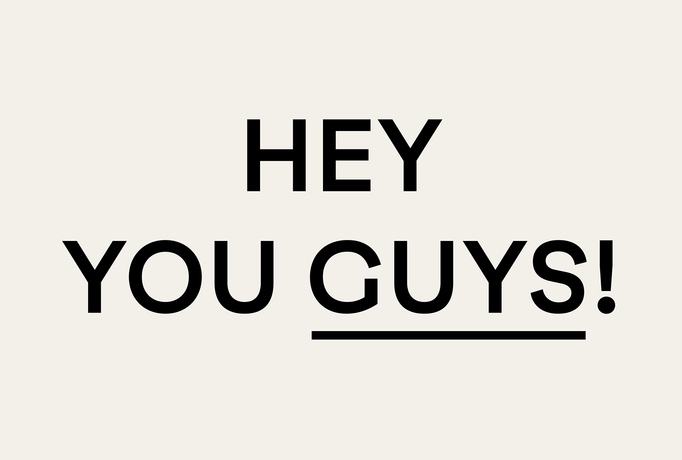


Typographical inspiration is often sparked by a tiny oddity or quirk. That’s the story of F37 Grotesc, the font that was born from a serious case of overbite.
At F37 Foundry, the old type specimen books we find in second-hand bookshops and online are a source of constant inspiration to us. Leafing through one of these typographical treasure troves a few months ago, we came across the wonderful Pica Sans, a quirky old grotesque font with such a huge overbite on the cap C that it almost looks like an O!
We took this exaggerated feature and ran with it, applying it to various letters like uppercase C and G and lowercase c, g and s. The rest of the font is fairly conventional, taking some inspiration from Breite Grotesk, a late 19th-century German sans, which is probably contemporary to Pica Sans.
F37 Grotesc comes in two versions, one for text, which is more legible and optically balanced. And one for display, with the quirkiness and overbite turned up to 11.
With 7 weights in each version (Optical & Text), all with matching true italics, F37 Grotesc is packaged together as 28 static fonts, as well as a 3 axis variable font — available when purchasing the whole family.
